The difference between readable and illegible design often comes down to colour. A few years back, I watched a presentation on colour blindness that completely shifted how I think about design. The speaker—a designer with red-green colour blindness—described the frustration of sitting through data-heavy presentations where critical information was conveyed only through red and green dots. That moment stuck with me. It’s easy to overlook how many people struggle with digital content that sighted, non-colour-blind people take for granted.
If you’re creating online courses, building web content, or designing infographics, accessibility in colour choice isn’t a nice-to-have—it’s fundamental. Getting colour right means your work actually reaches the people you’re trying to help. This guide walks you through practical strategies for selecting colours that work for everyone, grounded in current WCAG standards and international accessibility regulations that are now legally binding in many regions.
Why Accessible Colours Matter
Colours don’t just look nice. They actively shape how people understand and navigate your content. Yet for many users, standard colour choices create real barriers.
Around 1 in 12 men and 1 in 200 women experience some form of colour vision deficiency. Red-green colour blindness tops the list, but it’s far from the only problem. People with low vision struggle with insufficient contrast. Those with light sensitivity find bright screens painful. Cognitive disabilities mean some users process colour differently depending on context and fatigue levels.
Here’s the thing: accessibility standards aren’t abstract guidelines drawn up by committee. They reflect real needs. The Web Content Accessibility Guidelines (WCAG 2.2, published October 2023 and updated December 2024) emerged from decades of research and user testing. The European Accessibility Act (now mandatory across the EU as of 28 June 2025) and Section 508 (US) took these standards and made them legally mandatory. Organisations now face genuine legal consequences for failing to comply. More importantly, many people—clients, students, employees—can’t access your content if you skip this step.
Best Practices for Accessible Colours
1 Prioritise High Contrast First
Start with contrast. This is non-negotiable. WCAG 2.2 sets clear minimums:
- 4.5:1 contrast ratio for regular text
- 3:1 contrast ratio for large text (18pt/24px regular weight or 14pt/18.66px bold)
Black text on white? That hits 21:1. It’s the safest bet. Light blue on white? That might only be 3:1, which fails for body text. You need actual numbers, not guesswork.
Use the WebAIM Contrast Checker or WCAG Colour Contrast Checker—both are free—to test your combinations. These tools are freely available and should become part of your standard workflow. Testing takes two minutes. Not testing costs you users and, increasingly, legal exposure.
See the WebAIM Contrast checker for accessible colours in action:

2 Avoid Colour-Only Communication
This mistake shows up constantly: a red line means danger, a green line means safe. Sounds clear? Not for 8% of men with red-green colour blindness. To them, both lines look identical.
Your data visualisations, status indicators, and warning messages need more than colour. Layer in labels, icons, patterns, or symbols. Green and red buttons? Add “Approved” and “Rejected” text. A chart with red and green lines? Include distinct line patterns (solid, dashed, dotted) and clear legends. This practice isn’t just accessibility—it’s better design for everyone, regardless of how their eyes work.
WCAG 2.2 Success Criterion 1.4.1 explicitly requires this. It’s not ambiguous.
3 Choose Colours That Actually Work for Colour-Blind Eyes
You don’t need to memorise which combinations fail. But knowing a few key facts helps immensely.
Red-green pairings? Avoid entirely. Blue-yellow combinations create problems for some users, as do green-brown and blue-purple pairings. These aren’t edge cases—roughly 8% of men experience red-green deficiency alone.
Here’s what does work reliably: blue paired with orange or red. This combination remains distinguishable across protanopia, deuteranopia, and tritanopia—essentially all common types of colour vision deficiency. Research backs this up consistently. For any data visualisation or infographic requiring multiple colours, starting with a blue-orange palette is your safest bet.
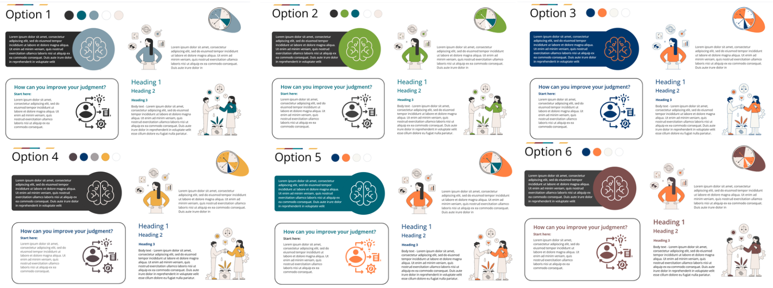
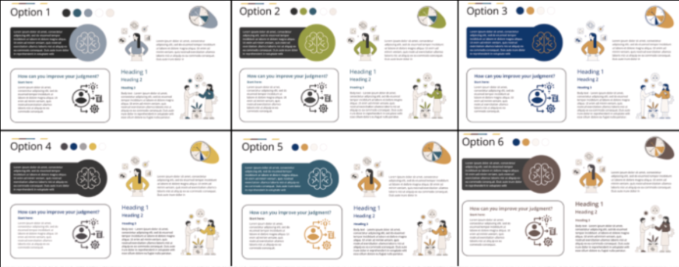
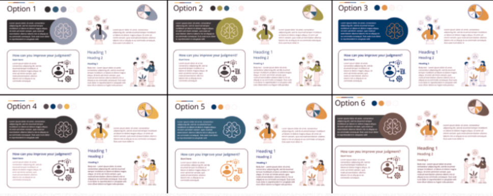
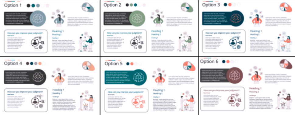
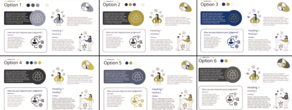
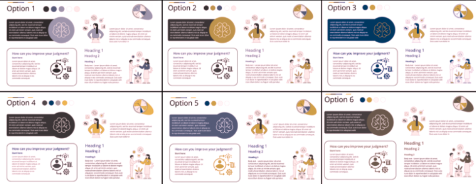
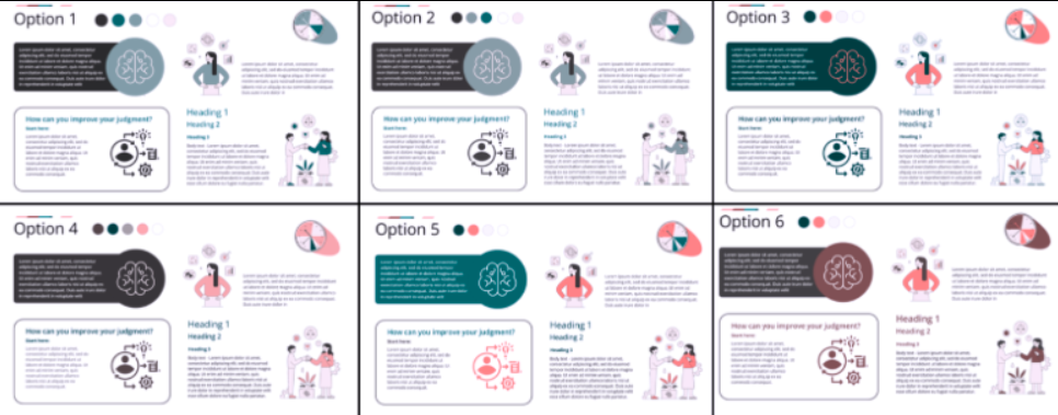
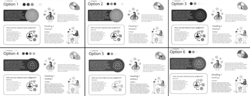
Use free tools to verify. Coblis is a colour blindness simulator—paste your design and see exactly how it appears to users with different colour vision types. Testing takes minutes and eliminates guesswork.
See the examples from the Coblis is a colour blindness simulator for different types of vision impairment:
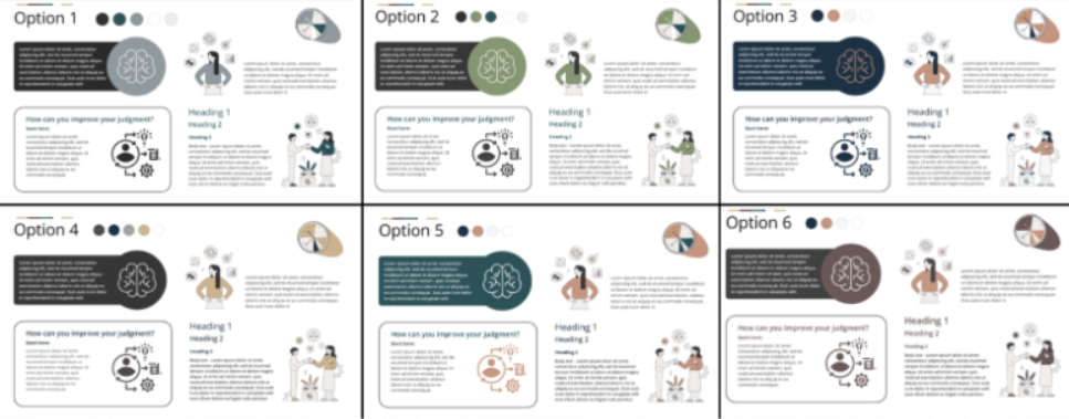
4 Apply the 60-30-10 Principle
This principle comes from design theory and it actually works for accessibility. The 60-30-10 rule suggests:
- 60%: Dominant colour (usually your background)
- 30%: Secondary colour (supporting elements)
- 10%: Accent colour (calls-to-action, highlights)
Why does this matter? Overloading a design with multiple colours creates cognitive load. It’s particularly taxing for users with cognitive disabilities. Spreading colours deliberately—giving one colour room to breathe, using a second for structure, reserving a third for emphasis—creates natural hierarchy.
5 Design Infographics with Pattern and Colour Together
Infographics live or die by clarity. Yes, colour helps. But colour alone isn’t enough.
Choose balanced, well-contrasted palettes. Avoid oversaturation or muddy pastels. But here’s the critical bit: combine colours with distinct patterns or textures. Different hues with matching patterns confuse people. Different patterns with matching hues confuse colour-blind users. Use both. Add labels. Repeat information across multiple channels. This redundancy isn’t wasteful—it’s what makes infographics actually work.
6 Be Cautious with Bright and Fluorescent Tones
Neon green backgrounds and bright orange text cause eye strain. Some users experience light sensitivity; for them, fluorescent colours trigger headaches or visual fatigue. Muted, slightly desaturated tones work better—especially for backgrounds. Pair them with high-contrast text and your design stays readable without causing discomfort.
WCAG 2.2 Updates Worth Knowing
WCAG 2.2, released in October 2023 and updated in December 2024, added several success criteria relevant to visual design:
Focus Not Obscured (2.4.11 and 2.4.12) ensures keyboard focus indicators remain visible. This matters for colour accessibility because focus states need adequate contrast with surrounding elements. A light-coloured focus ring on a light background renders invisible. Your interactive elements need careful colour planning across multiple states—default, hover, focus, active, disabled.
Focus Appearance (2.4.13) sets minimum size and contrast standards for focus indicators themselves. Designers often treat focus states as an afterthought, but WCAG 2.2 now considers them front and centre.
These updates reflect a shift toward viewing accessibility holistically. Static content matters. Interactive elements matter even more.
Tools (All Free, Definitely Use Them)
- WebAIM Contrast Checker – Industry standard for testing contrast ratios. Paste two colours, get precise contrast ratios and WCAG compliance status.
- WCAG Colour Contrast Checker – Dedicated tool from AccessibleWeb. Quick and reliable.
- AudioEye Colour Contrast Checker – Another solid free option for rapid testing.
- Color Oracle – Colour blindness simulator. Download, run it, preview your designs exactly as colour-blind users see them.
- Coblis Colour Blindness Simulator – Free online simulator. Upload your design or navigate to a website and it shows how different types of colour vision deficiency perceive it.
- Adobe Colour Wheel – Includes accessibility filters if you prefer working within design software.
Colour Combinations That Work
These pairings have been tested and work reliably. Always verify contrast ratios for your specific usage:
| Colour Pair | Contrast Ratio | Use Case | Notes |
|---|---|---|---|
| Dark blue (#003366) on white (#FFFFFF) | 12.6:1 | Body text, primary contrast | Excellent for readability |
| Black (#000000) on light yellow (#FFFFE0) | 19.6:1 | Headlines, emphasis | Warm tone, distinctive |
| Navy blue (#000080) on white (#FFFFFF) | 15.5:1 | Professional settings | Slightly less harsh than pure black |
| Dark blue (#003d82) with orange (#FF6A00) | Varies by shade | Data visualisation, charts | Optimal for colour-blind users |
| Teal (#008080) with dark pink (#C71585) | Varies by shade | Multi-colour designs | Distinguishable across most colour deficiencies |
| Dark grey (#333333) on light grey (#F2F2F2) | 11.7:1 | Secondary contrast | Softer than pure black/white |
For multi-colour data visualisations, prioritise blue-orange or blue-red combinations as your primary colour differentiators. Supplement with patterns or textual labels for additional categories.
What Not to Do (And Why People Get This Wrong)
Now that we’ve covered what works, let’s talk about the mistakes that genuinely trip up designers—even experienced ones.
1 Don’t Use Red and Green Together
Red-green feels intuitive. Green for good, red for bad. Stop-light logic. Unfortunately, roughly 8% of men have red-green colour blindness. To them, these colours appear almost identical. You’re essentially telling them the same information twice in a way they can’t distinguish.
Avoid red-green pairings entirely. Status indicators, charts, alerts, infographics—wherever information hinges on these colours, you’re excluding people unnecessarily.
2 Don’t Rely on Blue-Purple, Green-Brown, or Similar Combinations
Beyond red-green, several pairings cause problems:
- Blue and purple are too similar in hue. Users with tritanopia (blue-yellow colour blindness) particularly struggle
- Green and brown blend together for many colour-blind users
- Blue and grey offer insufficient distinction for users with certain deficiencies
- Green paired with blue, grey, or black similarly lacks adequate contrast
Test combinations before finalising. Don’t guess.
3 Don’t Create Low Contrast Between Text and Background
Designers sometimes pair light grey text with white backgrounds, thinking it looks sophisticated. It looks terrible for anyone with low vision. Yellow text on a bright background? Same problem. These combinations fail WCAG 2.2’s 4.5:1 minimum contrast ratio by a huge margin.
Run everything through a contrast checker. It takes 30 seconds and saves you from publishing inaccessible content.
4 Don’t Rely Solely on Colour to Communicate Information
This is perhaps the most frequent mistake I see. Status indicators, pie charts, categorical breakdowns—designers use colour alone to distinguish categories. Without accompanying labels, text, or patterns, you’re creating an access barrier for colour-blind users and often for low-vision users too.
Always supplement colour with additional communication methods. This isn’t extra work—it’s actually better information design.
5 Don’t Pair Similar Hues Without Checking Contrast
Red and orange seem different until you realise they don’t have adequate luminosity (brightness) contrast. Purple and magenta. Dark navy and black. Colours can differ in hue but still fail because their brightness values are too similar.
Use a contrast checker to verify luminosity contrast, not just hue difference.
6 Don’t Use Oversaturated or Pastel Palettes Without Testing
Bright, saturated colours can improve visibility, but excessively neon tones cause eye strain and fatigue. Pastels look soft but often fail contrast requirements entirely. Always test against actual WCAG standards before committing to your palette.
7 Don’t Skip Colour Blindness Simulation
This one is straightforward: don’t design something you haven’t tested with a colour blindness simulator. Coblis and Color Oracle are free. Your design appearing fine to your own eyes doesn’t mean it’s accessible. Spend five minutes simulating. It catches problems that contrast checkers alone won’t catch.
8 Don’t Use Yellow as a Standalone Foreground Colour
Yellow creates a specific problem. It requires lightness to be visible, which means it’s inherently low-contrast against bright backgrounds. Yellow text on white? Nearly invisible. If yellow is essential to your design, pair it with an adjacent dark UI element to provide context and prevent information loss for colour-blind users.
9 Don’t Treat WCAG Compliance as Optional
This is a business problem, not a design problem. WCAG 2.2 compliance isn’t optional—not anymore. The European Accessibility Act mandates it. Section 508 requires it. The Americans with Disabilities Act enforces it. Organisations skipping accessibility face real legal risk.
In 2024 alone, over 4,600 digital accessibility lawsuits were filed in the US under ADA requirements. These numbers are climbing. Accessibility isn’t a feature. It’s a legal requirement and a basic matter of respect.
Relevant Standards and Regulations
WCAG 2.2 (October 2023, Updated December 2024) – The latest web accessibility standard from the W3C. Colour-specific requirements appear in Success Criterion 1.4.1 (Use of Colour), 1.4.3 (Contrast Minimum), and the newer 2.4.11–2.4.13 (Focus Visibility). This is your primary reference.
European Accessibility Act (Effective 28 June 2025) – EU-wide requirement for digital accessibility. New digital content must comply now; existing content has until 28 June 2030. This covers websites, apps, e-learning platforms, and digital documents.
Section 508 (US, 2017 with Ongoing Updates) – Requires federal agencies and contractors to meet accessibility standards. Many US states and private organisations follow Section 508 as their accessibility baseline.
In Summary
Good colour design is invisible—people notice when you get it wrong, not when you get it right. The goal isn’t to win design awards for your palette. It’s to ensure your content is readable, understandable, and accessible to as many people as possible.
The mechanics are straightforward: prioritise contrast, test combinations against actual standards, avoid colour-only communication, and use freely available tools. The 60-30-10 rule creates natural visual hierarchy. Blue-orange combinations work reliably for colour-blind audiences. None of this requires specialised knowledge.
What changes everything is actually doing it. Not planning to do it. Actually doing it. Test your current designs against WCAG 2.2 standards today. With the European Accessibility Act taking effect on 28 June 2025, waiting isn’t an option. Your students, clients, and employees depend on this. So do a lot of people you’ll never meet.
Select the heading and arrow below to view additional resources on accessibility.
- Web Content Accessibility Guidelines (WCAG) 2.2
- WCAG 2 Overview
- WCAG 2.2: What You Need to Know
- The Future is Accessible: The ABC of WCAG 2.2
- WCAG 2.2: Key Updates and Guidelines for Web Accessibility
- European Accessibility Act 2025: Everything You Need to Know
- EU Accessibility Act 2025: 5 Best Practices
- The European Accessibility Act 2025: An Internet for All
- European Accessibility Act – What It Is and How to Implement It
- A Checklist for the European Accessibility Act (EAA)
- Fact Sheet: New Rule on the Accessibility of Web Content
- Making Color Usage Accessible
- Accessible Colour Palettes
- Accessibility and Colour
- How to Make Scientific Figures Accessible to Readers with Color Blindness
- Colour Blindness Statistics 2025 By Vision Deficiency
- A Global Perspective of Color Vision Deficiency
- About Colour Blindness
- The Misuse of Colour in Science Communication
- Creating Accessible Digital Colour Palettes Using the 60-30-10 Design Rule
- Accessible Colors: A Complete Guide for Web Design
- Inclusive Website Color Palettes for Accessibility
- A Practical Guide To Designing For Colorblind People
- Colorblind-Friendly Palettes: Why & How to Use in Design
- Guide to Accessible Colours Palettes [Templates Included]
- An Introduction to Colour Blindness Accessibility
- Common Mistakes with Using Colour in Accessibility
- Colour Blindness & Colour Choices
- Inclusive Design: Colour Accessibility
- What Colours to Avoid in Your Designs for ADA Compliance
- Yellow, Purple, and the Myth of “Accessibility Limits Colour Palettes”
- The “Dark Yellow Problem” in Design System Colour Palettes
- Colour Contrast Accessibility: Complete WCAG Guide
- Colour Contrast and Accessibility – A Complete Guide
- WCAG Colour Contrast Checker
- Contrast Checker
- Colour Contrast Checker
- Colour Safe – Accessible Web Colour Combinations
- Coloring for Colourblindness
Lorem ipsum dolor sit amet, consectetur adipiscing elit. Ut elit tellus, luctus nec ullamcorper mattis, pulvinar dapibus leo.
Subscribe to my mailing list and get the tools!
Subscribe and get the Learner Persona Generator and Learner Persona Template!
Thank you!
You have successfully joined our subscriber list.
Now check your mailbox - the checklist should be there!
Make sure to check your Spam or Junk folder if it is not in your Inbox!
Note, that this post provides general information about Accessible Colours.
It is important always to consider the specific context and requirements of your learning projects. If you have any questions or would like to delve deeper into the topic, please email me or book a free online consultation via my contact page.
Make sure to check out my other posts related to planning online courses, designing and developing learning content and delivering training. I share strategies and tools that you can use and many practical tips.
